|
|
|
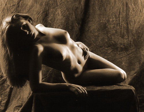
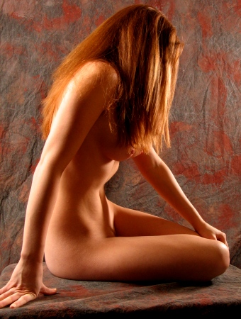
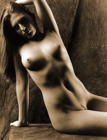
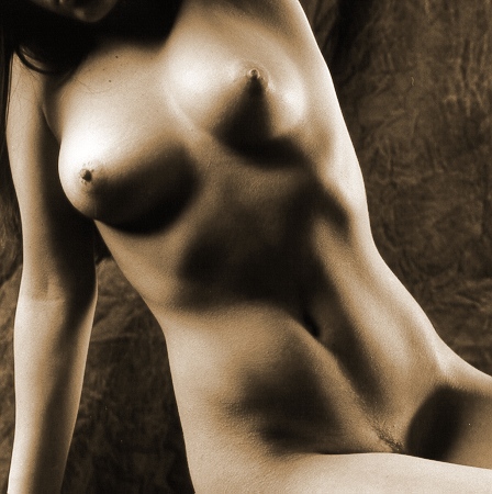
Actually,
this is the transition picture
from the last setup, the Table
Variations from the previous
page. This is the image that
inspired me to move closer.
I use the digital camera to snap a
test image (below), and I wind up
producing one of my favorite
images from this
sitting. |
|
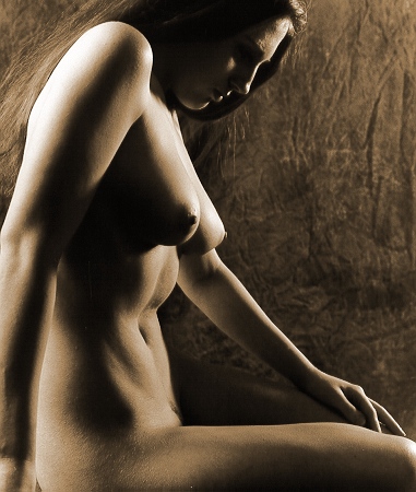
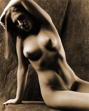
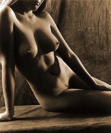
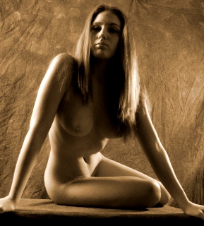
Let's
pause for a moment & discuss
the image, above. It is
the first digital image I've
made that I like
aesthetically. Usually,
I'm not overly concerned about
the precise pose, and there is a
pause between the pressing of
the shutter button & the
exposure, but I really like this
picture! I like the
lighting, the pose, the angle,
Brooke's expression -- it all
works for me. It's a
tribute to Brooke's innate
modeling ability -- she was
ready & "on" &
looking good, even between
exposures.
There
was a good amount of digital
processing done to this
image. See below:
 |
This is
the original digital
images (shrunk, of
course). I liked
it as soon as I saw it,
but I played with it a
little bit, producing
the final image that you
saw above.
Although it technically
is a color photograph,
there isn't a wide palette
of color in it. |
 |
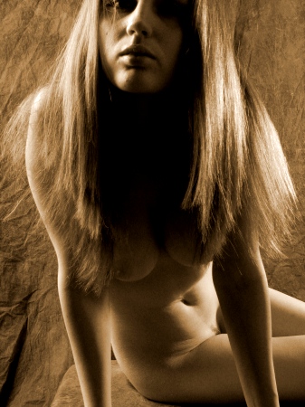
Here,
using Paint Shop Pro, I
"colorized"
the image, applying the
"sepia" tone
settings that I've used
for the other images on
these pages. The
settings were Hue=23
& Saturation=75%.
(As
a note, I do apply the
occasional effect on the
film/paper images I scan
for these pages, but my
rule is that I won't
apply any effect that I
couldn't & haven't
duplicated in the
darkroom. Sepia
toning is fine, since
I've done sepia toning
of images in the
darkroom. I love
sepia toned images.) |
 |
I've
noticed that the film
images I produce look
very different from the
digital images. I
feel that I've learned
to produce film images
with optimal brightness
& contrast, but the
interesting thing is
that using the exact
same lighting setup, the
digital images look
different (lower
contrast). Using
Paint Shop Pro, I
increased the contrast a
whopping 25%, and I
bumped the brightness up
2, to maintain a little
detail in the shadows
(i.e. you can still see
her right breast, or at
least I can). |
I've
wondered why the Paint Shop Pro
effect is called
"colorize", since
applying the effect removes
color from the original digital
image, replacing it with
monochromatic image.
Interesting
enough, I use the same
"colorizing" effect on
the black & white film/paper
images,
and yet the converted digital
image looks quite different
(more golden) from
the "colorized" film
images. I figure it's
because I changed the brightness
& contrast
after applying the colorizing
effect. |
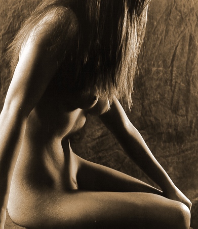
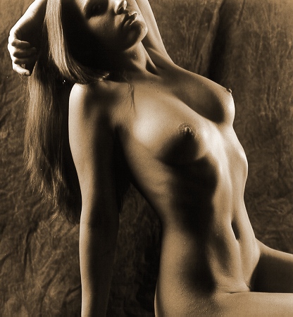
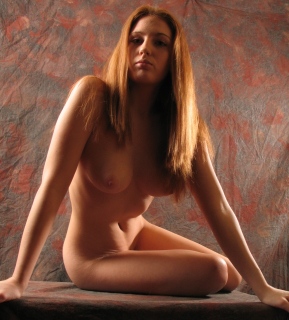
| Here's
another example of a digital
image that has the same effects
applied (which do you prefer?): |
|
|
|
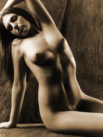
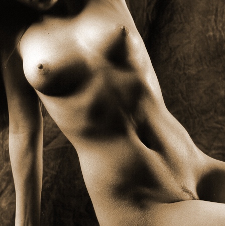
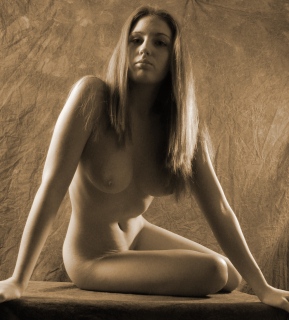
Okay,
one
last digital image (below), followed
by film images.
Once
I made the digital image, above, I moved
back to using the film camera. At
the time, I liked the image above (I
still do), so our next few exposures
were variations on that pose.
I
like seeing muscular abdomens on women. These
pictures show off Brooke nicely.
|
|
Sometimes,
when you are photographing a
figure, it's difficult to devise a
lighting setup that works for both
the figure & the face, but
someone how don't mind that there
are a lot of shadows across
Brooke's face
in this picture & the ones
above. Regardless, I move
even closer. |
|
|
Photographing
nude figures with contrasty, shadowy,
directional light is cliché #1, and
frankly, I've seen so many that I
rarely like any. Note some of
the differences & variations with
these images -- they are instructive:
-
I
don't use a single light source;
for these images, I used two, and
I've been known to use three or
four. The light sources are
placed such that they do create
some interesting shadows, and the
"off-side" of the figure
is somehow defined, which
contributes to the sense of depth
in the image. In this case,
the "off-side" is lit
directly, in other images (like
this one), the background is
lit & the "off-side"
of the figure is silhouetted.
-
The
cliché images typically use black
background & foreground, but I
don't. Here in these images,
the background and the platform on
which Brooke sits have some
texture.
Stepping
back, this is the first time I
produced digital images that were
"keepers". I've got to
admit that this was mostly by accident
-- the digital images were only test
exposures; I was just trying to
preview the lighting. But such
was Brooke's ability that even the
digital images were special.
This
could signal a change for me:
the cost of film, paper, and chemistry
for a typical sitting can run close to
$100. I've been "laid
off" for over a year, and I'm
hoping to avoid needing to replace my
lost job, but I've gotten to the point
that I'm a bit more concerned about
finances. (Have you seen my Voluntary
Donation page?) In addition,
the darkroom works requires lots of
time -- each 3 hour sitting often
implies 16-20 hours of work to get to
this place I'm at now, with images
printed & scanned and web pages
are being drafted. It's alluring
to think that going digital would
imply a significant savings in both
money & time. But still I
hesitate -- my yardstick has been
& still is the quality of the
image I can hang on the wall, and I
still feel that digital doesn't come
close to what a skilled photographer
can do with film & paper.
So, perhaps in the future, I'll make
more digital exposures, but I won't
give up film quite yet. Let me
ask you -- can you see the differences
between the digital & film images
on this page? (I know, all
the images on this page are digital,
but to me they look different -- do
they look different to you?)
Anyway,
when I work with a new model for the
first time, I like to try out a
variety of lighting setups, just to
see how they look & respond to
different lighting situations.
By now, we had perhaps a half hour
before Victoria arrived, and we had
exposed around seven rolls of film, so
for the final few rolls, I invite
Brooke to pose on my back stairs.
Brooke's
solo pictures conclude on the next
page:
The
Back Stairs
|