|
As I
mentioned towards the end of the first setup from the previous
page, when we removed the table & lamp, we lost the fill light,
and Jessica's side that was opposite the main light fell into shadow and
disappeared into the shadows of the background. And as I
mentioned, I don't like these kinds of images. So, we corrected
this. We removed the funky chair from the image, and added an
extra strobe to replace the fill light. The result: some
beautiful lighting for a beautiful model. For the rest of the day
of exposing film, we used variations on this lighting.
|
|
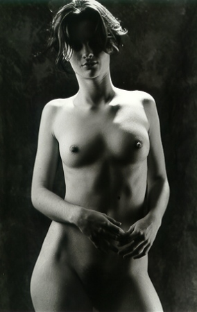
| I
use the digital camera to preview the lighting. Something
that I want you to remember when you are looking at most of these
digital color images -- I'm only looking at the lighting & I'm
not concentrating on the model's pose or facial expression.
So, here is the initial image that we used to check out the
lighting.
What do you
think? Well, I didn't like it, or rather, I knew I could do
better. Here's the stuff I corrected:
- I didn't
like the shadow on the left side of Jessica's face, so I moved
the main light a little further back & raised it a bit
higher.
- I felt that
the fill light provided too much fill, so I moved it back,
too.
Corrections
made, we continued. |
|
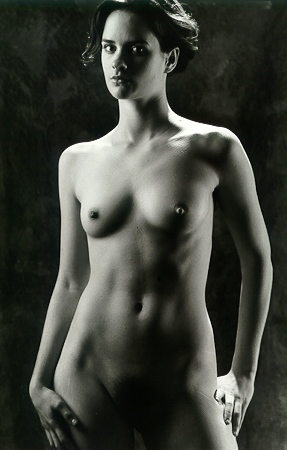
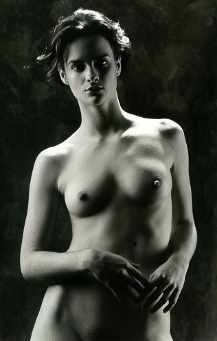
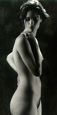
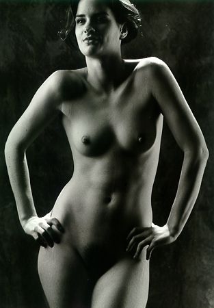
I've
always found it challenging to devise a lighting scheme that compliments
both figure & face. But here's two good examples of why I like
this lighting: first the image on the left -- I do like shadowy
pictures, I just don't like it when shadows disappear into shadows.
With the fill light in place, there's still lots of shadows, but Jessica's
figure is well defined. I also like that you can see a lot but you
can't see everything -- that way your imagination has to fill in the
blanks. Finally, I don't mind that her eyes are hidden in shadow --
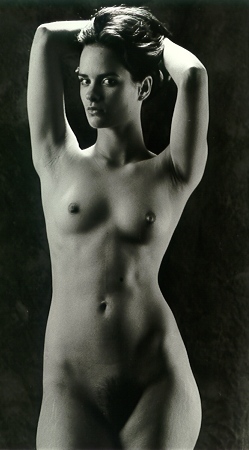
you can still see enough of her expression. Now, the image of the
right: I like how Jessica's left eye pops out of shadow, and with
her hands more to her sides, you can see her muscle tone really well,
especially with this light, because the shadows define her
shape. In retrospect, the hair light is a bit much -- it could have
been toned down a bit, and it could have been moved further back (to keep
it off of her shoulders), but overall, I don't mind that much. I
really like the images from this setup.
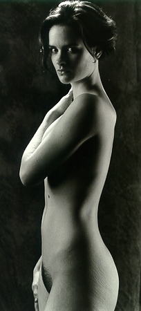
Here
above is one of my favorite images from this sitting and my favorite from
this setup. I mentioned
that Jessica fidgets, and when she got herself into this pose, with her
hips cocked & her shoulders skewed, I had to ask her to freeze.
My experience is that when you ask a model to freeze, they rarely do or
they freeze too late, but
it worked out well in this case. This was one of those rare circumstances
when I knew, just knew, that I've made a superior image right there in the
sitting -- usually, I have to wait & see what develops (literally).
More
images from this setup.
|
|
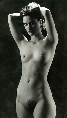
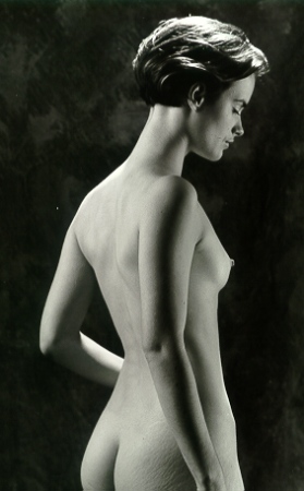
If
you take my advice & deconstruct/analyze lighting, this one will
give you a good hint about the placement of the lights.
You can tell that it is behind Jessica because much of her face is
still in shadow. Again, that hair light is a bit bright, but I
like how the hot spot on Jessica's left shoulder is bouncing back up
to light her neck & chin. Lots of good things are going on
here. |
| Okay,
here's a visual quiz for those of you trying to
deconstruct/analyze lighting -- what is different about this
picture, compared to the other images on this page?
There are less
shadows across Jessica's figure, and the light is softer all
around; further, there is no hot spot caused by the hair light
(with the exception of the light on her hair, which is the point,
after all).
Next
question: how was this achieved? I suppose it could
have been achieved by making adjustments to all three lights, but
the truth of the matter is that in her posing, Jessica has drifted
slightly away from the camera & more directly into the light.
The challenge with small studio spaces is that just a little
movement can make a dramatic difference in the lighting.
How did you
do? |
|
|
|
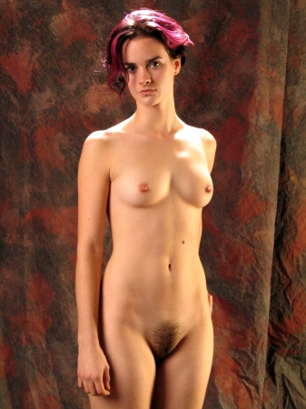
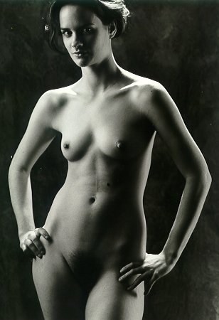
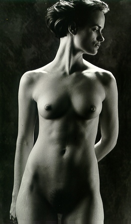
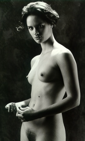
One
question for all of you: what do you think about that beauty
mark on Jessica's upper abdomen? As far as I can tell, that's
her only mark. I suppose I could have done some digital
manipulation to remove it, but it doesn't bother me at all.
Jessica is all natural -- no tattoos, no enhancements, and no body
piercings. In all these images, I get the sense (and I hope
you get the sense) that we are looking at a real person, and not
someone's imitation of someone else's ideal. That mark shows that she is real. |
|
| Some
photographers go into their sitting with a specific image in mind, and
all they do is produce that one image. Some day, I can see myself
doing that. But my approach is that I have a handful of setups
(setup = lighting + poses + props + backgrounds) in
mind, and within the context of each setup, we experiment, trying
different variations until we get a match.
Eventually, I get the
feeling that we are not making further progress within a specific setup, and at
that time, I ask myself whether there's anything else we should try
before we move on. If the answer is "no", then the model
gets to take a short break while I make changes to the setup.
Jessica's
sitting continues with the "Mirror Image" setup. |